Are you planning to revamp your fitness logo design or investing to have a new one?
Well, there are certain logo design rules that you must exercise in order to have an evergreen, attractive fitness center logo.
Lucky for you, we’ve underlined some of the key fitness logo design rules below. Come, let us tell you how to make your fitness logo design perfect in every way and get most out of your branding with the right footing via your fitness center’s logo.
Timelessness
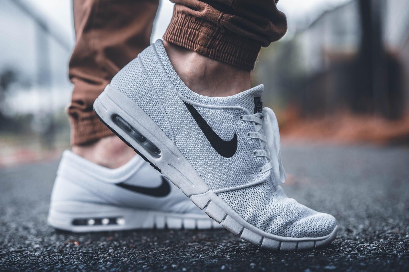
From Adidas to Nike and more, every fitness brand has one thing in common when it comes to their logo design.
Their logos remain relevant in every era!
Being timeless is one of the elements of great fitness logo designs that you must seek to add in your logo, too. Make sure your designer bestows this feature to your fitness logo so you won’t be revising the design altogether every year if you truly want to have a remarkable fitness logo design.
Communication
One thing that most averagely performing brands miss is the communication factor in their branding.
By selecting certain color, certain font and a particular design, you set the mood of the brand that further communicates with your audience. So, it is important to include the element of communication in your fitness logo design in order to start the discussion with your audience via the logo itself.
Relation
If you want to have a fitness logo design that goes beyond the mere seduction of a design and connects with your audience, you have to instill the relatability in it.
Logos having the relatability element perform better than those who attract eyeballs but fail to develop the connection with the customers. So, sit with your logo designer and ensure to lock the deal on a design that can help you in developing the relationship with the audience.
Personalization
Your fitness logo design would be used as your company face at many places and for variable purposes.
Make sure it is designed to maintain its elegance on different surfaces when you kick start your promotions on different channels. This would help you in maintaining the uniformity in your fitness logo design across all marketing mediums and merchandise, too.
Balance
The color and fonts are two important aspects of a logo design that demand due attention in order to form a perfect fitness logo design.
It is your duty, too, to approve only that design which is perfectly balanced on these constants during the designing process. Sit with your graphic designer or ask him to show you a few sample designs so you can select the best one for your brand.
Simplicity
All the great logo designs have one common feature in them, they’re simplest!
If you don’t want to confuse your customers with an extremely artistic fitness logo design, just play by the rules and keep it as simple as you can.
Comment below and share your approach for designing a fitness logo design for your company with fellow readers.


